CHAPTER 5: IN THE WORLD
This chapter covers an area – the impact of Australian NGOs’ work in the world – where much more information is needed. At present there is no data or indicators for two of the characteristics in this chapter. Gathering relevant data will not be easy but it will be a worthwhile future task, even if it can only ever be partial in its nature. For now, however, ACFID has collected useful data on some aspects of how Australian NGOs work in the world beyond Australia’s borders.
Highlights from the chapter:
- ACFID Statistical Survey data showsthat most ACFID members spend a high share of their total spending overseas. This spending is spread across work in a range of different types of work.
- The data does not reveal worrying patterns in the extent to which ACFID members are fragmenting their work across too many projects or countries. A careful read of the evidence does not suggest that there are significant trends towards increased country or project fragmentation. Commensurate with their size, larger NGOs typically have more projects and work in more countries.
- As a whole, ACFID Statistical Survey data suggests that Australian NGOs do not focus most of their work on the world’s neediest countries as per the Human Development Index (HDI)
(countries such as Niger and the Central African Republic). Although these countries get some funding, more funding is focused on countries such as Cambodia, where need is still high but not as acute. Comparatively affluent countries such as Chile receive the least funding from Australian NGOs. Need is not the only legitimate criteria for choosing which countries to focus on (other criteria such as potential to be effective and ongoing country relations also matter). As a result, this pattern in NGO spending is not concerning, although it does warrant more investigation. It may be the case that at least some ACFID members could and should be doing more to serve the world’s neediest countries.

Indicator: Funds disbursed (program spend) in absolute terms as well as percentage of funds raised (over time)
The first of these indicators looks at international aid program spend: how much money is actually directly spent on development work in developing countries. Figure 53 draws on data from the ACFID Statistical Survey and shows trends (for the short time period we have data for) in aid program spend for ACFID members. The trends broadly mirror those of total revenue shown earlier in this report.
Figure 53: Trends in program spending
Figure 54 shows international aid program spend as a percentage of total spend on international development work on average for each size group in 2016.35 Other development spending types are included in the chart as well to provide a full picture of spending. Of the three size groups, larger NGOs have a somewhat higher share of their spending going to international aid programs on average, reflecting the economies of scale that larger organisations can attain.
Figure 54: Mean international program spending by size group (2016)
35 For ease of interpretation only one year is provided here. We studied data from 2013–16: there were no clear trends. In calculating the percentages, we excluded spending on domestic projects (for example the Red Cross’s domestic work) and other spending not associated with development work.
Indicator: ANCP data on in-country partnerships
Figure 55 shows data for ANCP-registered organisations provided to us by DFAT. The data is for the 2016–17 financial year. The data gives a sense of who ANCP-registered NGOs are partnering with in recipient countries. The percentages are shares of total funding spent. ANCP-registered NGOs are a smaller subset of the Australian development NGO sector than ACFID members are. For this reason, the caveat needs to be made that the data in Figure 55 may not be representative either of ACFID members or of the sector as a whole. Nevertheless, the data provides a useful starting point from which to build an understanding of how organisations are working in the field. Although government (and associated entities) are the largest single category in the chart, taken together, the related categories of local NGOs, faith-based organisations, and civil society organisations are larger. It is not a surprise to find that most ANCP funding is spent by Australian development NGOs in partnership with local NGOs, faith groups and other civil society groups in recipient countries. However, the chart also shows the diversity of partner organisations: not only are governments high in number but the private sector is also well-represented.
Figure 55: Who Australian development NGOs partner with in-country
Indicator: Extent to which NGOs are dividing their work across sectors, countries and projects
There are three components to this indicator; each requires a different type of interpretation. The first component is sectoral spend (with sector here meaning the type of work being undertaken; for example, work on economic development or health).
In the case of sectoral spend, the most obvious concern would be if one sector were dominating the work that NGOs were doing. The problems faced by the countries that Australian development NGOs work in are multifaceted. If Australian development NGOs are focusing foremost on need, then one would anticipate their work to be spread across a range of different sectors, rather than being monopolised by any one sector. Figure 56 shows sectoral funding allocations, averaged across each of the organisation size groups. The data comes from ACFID members’ reporting on individual projects. For the sake of easily interpretable charts we focus on 2016.36
Three points about Figure 56 bear noting. First, in all three size groups there is no evidence of any particular sector monopolising the work that NGOs do. Second, intriguingly of all the NGO groups, small NGOs are the group where the average member does the most economic development work. Third, humanitarian emergency work is most common amongst larger NGOs. The different shares allocated to humanitarian emergency work between larger and smaller NGOs is striking; however, it makes sense when one considers that large NGOs work in many countries and so are much more likely to have a humanitarian emergency occur in a country where they work (or where one of their international organisations work) in any given year.
36 Our analysis of trends over time shows some fluctuation in humanitarian allocations, stemming from differing disaster needs in different years. It also shows some rise in focus on the category ‘other social’, 2014–15. This trend appears to be the product of a change in the work of a small number of large NGOs. This fact and the fact that ‘other social’ did not increase further in 2016 suggest to us that that there are no strong sectoral trends across the bulk of ACFID members between 2013 and 2016.
Figure 56: Sectoral allocations, ACFID members (2016)
The second component of this indicator is the extent to which NGOs are dividing their work amongst countries and projects. We start by looking at countries. Everything else being equal, working in many countries isless likely to lead to effective aid than working in few countries. Working in many countries is likely to make it harder to gain country experience, and it will likely increase the administrative burden. Of course, everything else is not equal. Larger organisations will probably have institutional capacity that allows them to gain country experience in many countries. Also, there is no shortage of countries where the need for NGO work is high. For these reasons, there is no optimal number of countries that ACFID members should strive to be working in. There are, however, two patterns that would be concerning if we observed them.
The first of these patterns would be if the number of countries that ACFID members were working in was increasing rapidly. It is hard to think of any development reason for such an increase. Figure 57 shows the number of countries that ACFID members are working in, as a total, across the years we have data for. The data comes from the ACFID Statistical Survey. As can be seen, strong trends are not apparent. If anything, there was a downwards trend from 2013 to 2015.37 The first concerning pattern is not present.
37 A more technical approach to studying fragmentation across countries involves calculating a fragmentation index (usually 1 minus the Herfindahl–Hirschman index). We have not charted this here because the output is not as intuitively intelligible as simple country numbers. We have examined trends using a fragmentation index. When we did this, we found no evidence of an upwards trend in fragmentation.
Figure 57: Change in countries over time
The second concerning pattern that could emerge from examining data on fragmentation across countries, would be if small and medium sized organisations were, on average, working in as many countries as larger organisations. Figure 58 shows the number of countries that the median organisation in each of the size groups was working in, in 2016 (a similar pattern was present for the other years we had data for). The pattern that can be observed appears appropriate. The typical medium sized organisation works in fewer countries than the typical large organisation. The typical small organisation works in fewer countries still.38
Figure 58: Number of countries median ACFID members working in (2016)
38 This was also true when we looked at fragmentation index data, rather than simple country counts.
In Figure 59 the focus shifts from fragmentation across countries to fragmentation across projects. The chart shows the number of projects that the median organisation in each size group had active in each year from 2013 to 2016.
As with countries, there is no optimal number of projects. However, we would have cause for concern if smaller NGOs had as many projects as larger ones; this would be inefficient. We would also have some cause for concern if project numbers were on the rise. Encouragingly, the chart shows that medium sized NGOs have fewer projects than large NGOs and small NGOs have the lowest project numbers. The trends present across time are possibly more concerning. Although the upwards trends in project numbers is only very slight in smaller and medium sized organisations, it is more pronounced for the median large NGO.
Figure 59: Total number of projects over time for median NGO in each size group
The significant rise in the number of projects run by large NGOs may appear concerning. However, there are two reasons why the increase is not as worrying as it might seem. First, the group of large NGOs is small. A consequence of this is that although other data issues render medians more appropriate than means as a measure of trends, they still have limitations as a statistic. The rise in the median number of projects hides the fact that amongst large ACFID members, a small majority actually saw project numbers decrease over the period. Furthermore, the total revenue of ACFID members grew over the period from 2013 to 2016. Because of this, the fact that the median NGO in 2016 had more projects than the median NGO in 2013 does not mean that large NGOs have necessarily fragmented their work over smaller and smaller projects. Figure 60 shows the average (inflationadjusted) project size for the median NGO in each size group over time. As can be seen, for each of the size groups, project size has actually increased. To the extent that project numbers have grown for the median large NGO, this has been driven by increased funding, not more fragmentation across smaller projects.
Figure 60: Average inflation-adjusted project size, median organisation, by size group, over time
Indicator: Extent to which NGOs are focusing their work on countries where need is greatest
The final indicator under this characteristic is the extent to which Australian development NGOs are working in countries where need is greatest. Figure 61 is a global map that shows where ACFID members are working. It reports on funding from all sources. As can be seen, ACFID member organisations work in a very wide range of developing countries.
Figure 61: Global allocation of ACFID member funding for development and humanitarian projects
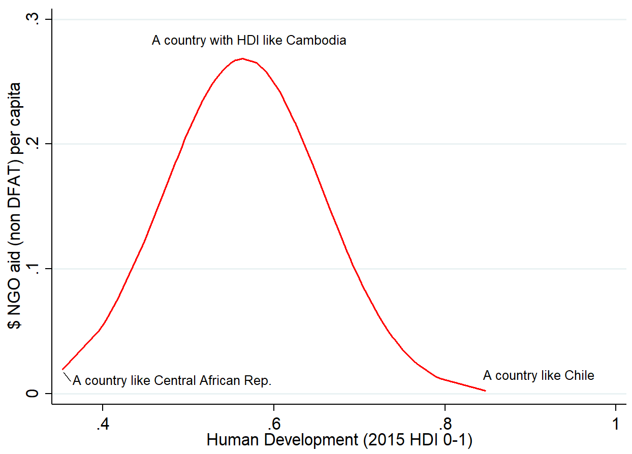
To test whether the bulk of ACFID members’ funding is allocated to countries where need is greatest, we chose to quantify ‘need’ as countries’ scores on the HDI. 39 Our development NGO country focus data comes from NGO project reporting in the ACFID Statistical Survey. We used NGO aid data from 2015 as that was the year for which the most recent HDI data was available when we undertook the analysis.40 In the following discussion we focus on how NGOs allocated money that they did not obtain from DFAT. Our rationale for doing this was that non-DFAT funding is likely to be funding which NGOs have the most discretion over, and our primary interest was to glean the priorities of NGOs themselves. However, we also ran the same tests including NGO funding from DFAT alongside NGO funding from other sources. When we did this, we obtained results that were very similar. In the discussion that follows, we focus on NGO aid per capita. However, we also ran the same tests using total NGO aid flows to countries and obtained very similar results.
We used multiple regression analysis to test for the relationship between need and NGOs’ country focus. The dependent variable in our analysis was total, non-DFAT country funding allocations, from all ACFID-member NGOs combined, per person in each developing country that received aid from Australian NGOs in 2015.
The central relationship we found existed both as a simple bivariate relationship and when we controlled for other variables to ensure that the relationship was not simply the accidental by-product of some other factor.41 The nature of the relationship can be seen in Figure 62. The relationship is not a simple one in which countries with greater need are given more money. Rather, countries with very low levels of human development, such as the Central African Republic and Niger, actually get less aid than countries with somewhat higher levels of human development such as Cambodia. Above a level of human development about that of Cambodia, higher human development is unambiguously associated with lower levels of assistance. Comparatively developed countries such as Chile receive very little aid from ACFID members.
To put this another way, as a group, ACFID members are not focusing the most on countries where need is greatest. However, the countries that they are allocating the bulk of their money to are countries where need is still high. Appropriately, they devote very little money to developing countries where need is lowest.
Few people would doubt that there is real need for aid in countries such as Cambodia. As a consequence, the pattern we have identified does not speak to a fundamental flaw in the way that Australian NGOs are allocating their aid. Need should not be the only driver of aid allocation; country experience and strength of partnerships are also important, as are other contextual features that may influence whether Australian NGO aid is likely to succeed in a particular country. It may be the case that ACFID members are focusing their work where they are because their strong ties and experience in these particular countries means that they know their work is likely to be more effective than it might be elsewhere. It might also be the case that Australian NGOs avoid some countries because they are the focus of NGOs from other donor countries. If this is the case, it would reflect an efficient international division of NGO labour, not an issue.
However, the pattern that we have identified should at least be cause for some NGOs to check whether they could be redirecting some of their work to countries where need is most acute. The existence of so-called ‘aid-orphans’, countries which need aid but which are under-funded, has previously been identified in international work on aid allocation (Ericsson & Steensen 2014). If the countries that are being under served by Australian development NGOs are also being under-served by other donors, there is a case to be made for increased attention from Australian development NGOs, particularly larger organisations or organisations that are part of international federations and which will be best placed to reallocate resources.
39 Academic work focused on whether government aid is allocated on a need basis has tended to use GDP per capita as its measure of need. However, we opted for the HDI as its more holistic view of development is closer to that held by most NGOs. We used GDP/capita as an alternative measure of need in our analysis. Doing this did not dramatically alter our findings.
40 Data from other variables used in our analysis also comes from 2015 or the closest available year.
41 Specifically, we controlled for region (the Pacific region was the only region that was statistically significantly associated with NGO spending; it was associated with increased funding), whether a humanitarian emergency was occurring in a country (which was positively associated with funding), quality of governance (no association with funding), level of democracy (no association with funding), and population (associated with less NGO aid per capita). The patterns we identified also held when we re-ran our analysis excluding World Vision (on the basis that they are so large that they might be driving findings on their own).
Figure 62: The relationship between NGO aid allocation and human development
Importantly, the relationship we have just described exists even when controlling for region in our regressions. This means that the relationship is not simply a product of Australian NGOs focusing more on closer regions such as the Pacific at the expense of areas such as Africa. Owing to small populations, the Pacific is the focus of more NGO funds per capita than any other global region. However, as Figure 63 shows, Africa is actually the global region where ACFID members distribute the most funding which isn’t sourced from DFAT. The relationship we have identified is not a product of differences between regions; rather it stems from differences in spending between countries.
Figure 63: ACFID member focus by region, excluding funding from DFAT (2016)
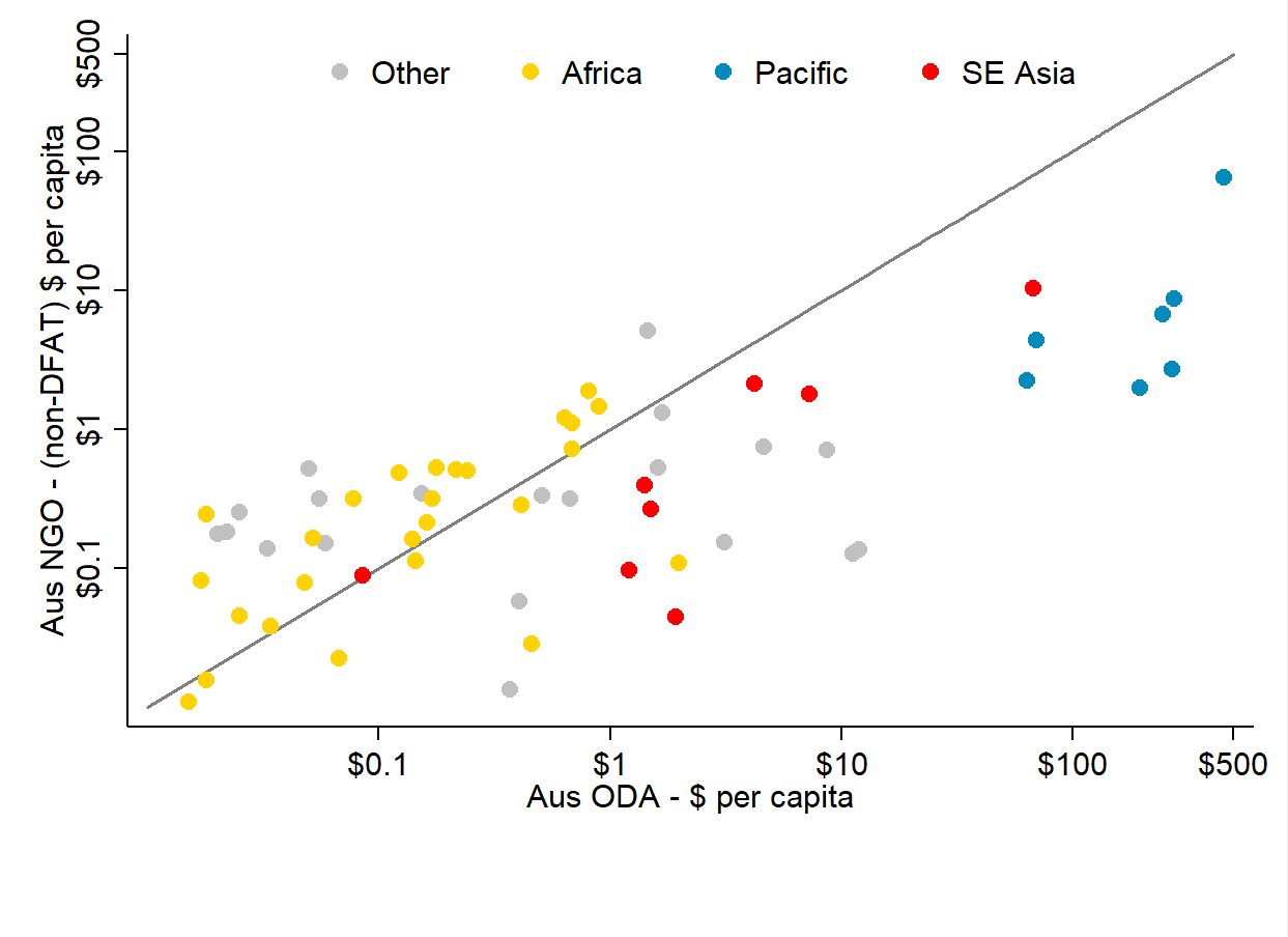
Figure 64 shows one final relationship that may be useful as we work in the future to learn more about why Australian development NGOs focus their work where they do. The chart shows the relationship between total Australian government ODA going to individual countries, and total ACFID member funding allocations (excluding money from DFAT) going to individual countries. All figures are per capita. Data isfrom 2015. NGO spending comes from the ACFID Statistical Survey. Australian ODA data comes from the Organisation for Economic Co-operation and Development. Individual countries are marked on the chart with dots. The colour coding of the dots distinguishes between different regions. The diagonal line on the chart marks the one-to-one relationship. Points on the line represent countries that receive as much ODA per capita as they do from Australian NGOs (excluding DFAT funding to NGOs). Points above the line represent countries that receive more funding from NGOs than from DFAT. Points below the line represent countries that receive more funding from DFAT than NGOs.
Importantly, to allow the chart to cope with the range in spending, both the x- and y-axes are plotted using log scales. In effect, this means that variation is compressed for countries that receive high amounts of ODA or NGO funding per capita. The log scales do not, however, affect the overall relationship visible in the chart.
The chart shows a clear correlation between Australian ODA spending and Australian NGO funding. Broadly, Australian NGOs and the Australian government have similar country focuses. However, as the preponderance of yellow dots above the line shows, NGOs place relatively greater emphasis on spending in African countries than the Australian government does. Similarly, the preponderance of red and blue dots below the line reflects a more intensive government ODA focus in these countries. The difference is particularly striking for the Pacific countries.
Figure 64:Australian NGO and ODA per capita funding by country (2015)
jQuery(window).load(function(){
if( typeof wpDataChartsCallbacks == ‘undefined’ ){ wpDataChartsCallbacks = {};
}
wpDataChartsCallbacks[53] = function(obj){
obj.options.data.datasets[5].backgroundColor =
[‘#E2CBBF’,’#E2CBBF’,’#E2CBBF’]
obj.options.data.datasets[5].borderColor =
[‘#E2CBBF’,’#E2CBBF’,’#E2CBBF’]
obj.options.data.datasets[4].backgroundColor =
[‘#D5B09B’,’#D5B09B’,’#D5B09B’]
obj.options.data.datasets[4].borderColor =
[‘#D5B09B’,’#D5B09B’,’#D5B09B’]
obj.options.data.datasets[3].backgroundColor =
[‘#C78E68′,’#C78E68′,’#C78E68’]
obj.options.data.datasets[3].borderColor =
[‘#C78E68′,’#C78E68′,’#C78E68’]
obj.options.data.datasets[2].backgroundColor =
[‘#B67337′,’#B67337′,’#B67337’]
obj.options.data.datasets[2].borderColor =
[‘#B67337′,’#B67337′,’#B67337’]
obj.options.data.datasets[1].backgroundColor =
[‘#A36630′,’#A36630′,’#A36630’]
obj.options.data.datasets[1].borderColor =
[‘#A36630′,’#A36630′,’#A36630’]
obj.options.data.datasets[0].backgroundColor =
[‘#8C5728′,’#8C5728′,’#8C5728’]
obj.options.data.datasets[0].borderColor =
[‘#8C5728′,’#8C5728′,’#8C5728’]
obj.options.options.scales.xAxes = [{stacked:true}]
obj.options.options.scales.yAxes =[{stacked:true, scaleLabel:{display:true,labelString: ‘Percentage of total spending’}}]}
wpDataChartsCallbacks[54] = function(obj){
obj.options.data.datasets[0].backgroundColor = [‘#66747E’,’#73848F’,’#7F919D’,’#899CA9′,’#93A7B5′,’#A1B3C0′,’#B2C0CA’,’#C0CBD3′,’#CED6DC’]
obj.options.data.datasets[0].borderColor = [‘#66747E’,’#73848F’,’#7F919D’,’#899CA9′,’#93A7B5′,’#A1B3C0′,’#B2C0CA’,’#C0CBD3′,’#CED6DC’]}
wpDataChartsCallbacks[55] = function(obj){
obj.options.data.datasets[0].backgroundColor =
[‘#786808′,’#786808′,’#786808’]
obj.options.data.datasets[0].borderColor =
[‘#786808′,’#786808′,’#786808’]
obj.options.data.datasets[1].backgroundColor =
[‘#8A770A’,’#8A770A’,’#8A770A’]
obj.options.data.datasets[1].borderColor =
[‘#8A770A’,’#8A770A’,’#8A770A’]
obj.options.data.datasets[2].backgroundColor =
[‘#99840D’,’#99840D’,’#99840D’]
obj.options.data.datasets[2].borderColor =
[‘#99840D’,’#99840D’,’#99840D’]
obj.options.data.datasets[3].backgroundColor =
[‘#A7900F’,’#A7900F’,’#A7900F’]
obj.options.data.datasets[3].borderColor =
[‘#A7900F’,’#A7900F’,’#A7900F’]
obj.options.data.datasets[4].backgroundColor =
[‘#B4A04D’,’#B4A04D’,’#B4A04D’]
obj.options.data.datasets[4].borderColor =
[‘#B4A04D’,’#B4A04D’,’#B4A04D’]
obj.options.data.datasets[5].backgroundColor =
[‘#C4B585′,’#C4B585′,’#C4B585’]
obj.options.data.datasets[5].borderColor =
[‘#C4B585′,’#C4B585′,’#C4B585’]
obj.options.data.datasets[6].backgroundColor =
[‘#D1C7A6′,’#D1C7A6′,’#D1C7A6’]
obj.options.data.datasets[6].borderColor =
[‘#D1C7A6′,’#D1C7A6′,’#D1C7A6’]
obj.options.data.datasets[7].backgroundColor =
[‘#DED7C2′,’#DED7C2′,’#DED7C2’]
obj.options.data.datasets[7].borderColor =
[‘#DED7C2′,’#DED7C2′,’#DED7C2’]
obj.options.options.scales.xAxes = [{stacked:true}]
obj.options.options.scales.yAxes =[{stacked:true, scaleLabel:{display:true,labelString: ‘Percentage allocated’}}]}
wpDataChartsCallbacks[57] = function(obj){
obj.options.data.datasets[0].backgroundColor =
[‘#98ADBB’,’#AD9610′,’#BF793A’]
obj.options.data.datasets[0].borderColor =
[‘#98ADBB’,’#AD9610′,’#BF793A’]}
wpDataChartsCallbacks[60] = function(obj){
obj.options.data.datasets[0].backgroundColor =
[‘#AD9610′,’#AD9610′,’#AD9610′,’#AD9610′,’#AD9610′,’#AD9610’]
obj.options.data.datasets[0].borderColor =
[‘#AD9610′,’#AD9610′,’#AD9610′,’#AD9610′,’#AD9610′,’#AD9610’]}
});
